This is a great question! If you already know that you look good in cool blues and greens, or in browns and rusts, who cares if you’re a Summer or an Autumn, Winter or Spring?
The not-so-short answer to a complex matter:
A palette of the most flattering hues for an individual, not only makes the person come vibrantly to life, it also has a unique harmony and mood, which many color analysts call a “season.” In clothing the season is most naturally expressed in particular color combinations, fabric textures and patterns, cut and drape, etc. A person’s palette is based on the hues, color “quality” and “temperature” of their skin tones, hair and eye color, as well as the contrast between these dominant features.
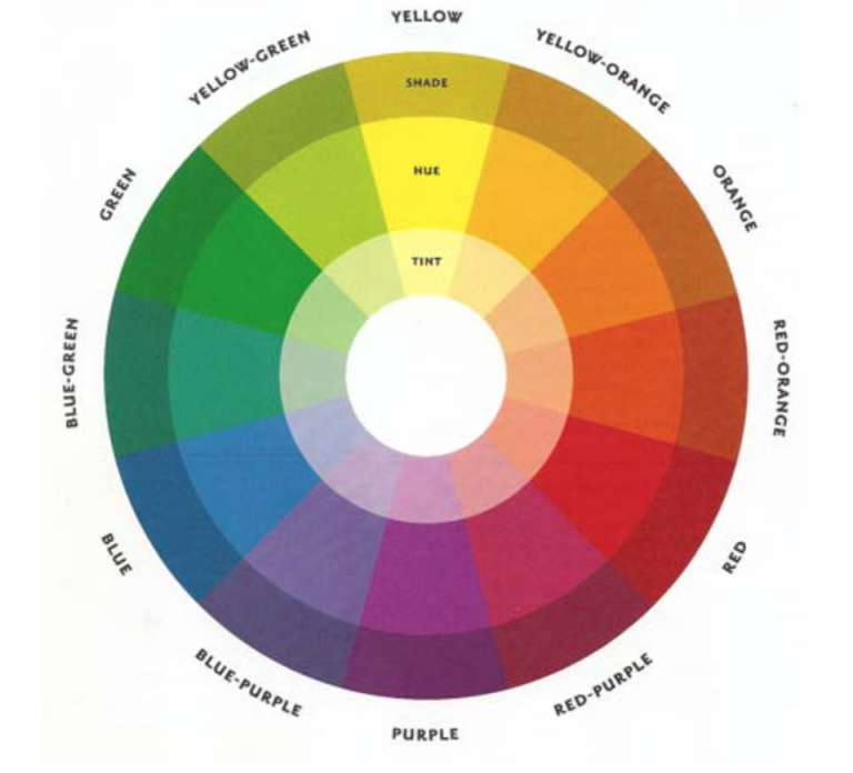
The color wheel, color qualities, and psychological “temperature”
Color quality: may be mostly intense (saturated – the pure hues in the large middle ring above), clear (diluted or tinted with white – the innermost ring), shaded (black added – the outermost ring above), muted (grayed down – not shown above), or earthy (toasted with brown – also not shown).
Temperature: The “cool” colors go from blue-green to red-purple. and the “warm” ones from yellow-green to red-orange. For personal color analysis true red and true green are considered “neutral” (neither warm nor cool in terms of psychological temperature).
Color relationships: Colors opposite each other are called complementary (for example red and green). A split complementary uses the two hues on the other side of the complement (e.g. red, blue-green and yellow-green). Three colors equidistant from each other are called triadic (e.g. red-yellow-blue). Colors next to each other are called analogous (e.g. red-purple, purple, blue-purple), and those that are just darker or lighter of the same hue are monochromatic.
Why is the color wheel relevant to the Seasons?
Another great question! Because each Winter, Spring, Summer or Autumn person looks most authentic when wearing clothes that mirror the color relationships present in their personal palette. [Note: Seasonal nomenclature goes back to colorists in the 1920s, and in some current analysis methods they may be called other names, like Types 1, 2, 3, 4, but how they play out in clothing styles is similar. I use the Caygill system which further specifies six sub-types for each Season, to allow for varying degrees of intensity, temperature, value and contrast in the coloring. Lots more about the development of personal color theory here in Wikipedia.]
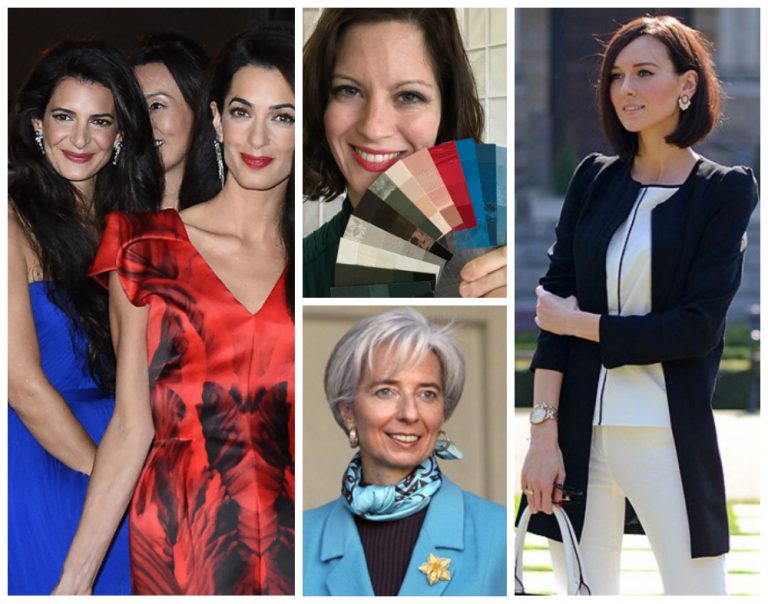
Winter palette hallmarks: Saturated color and icy pastels, high contrast. Best styles for a Winter are elegant, striking, and high contrast. Amal and George Clooney are warm Winters. Elizabeth Taylor was a cool Winter.
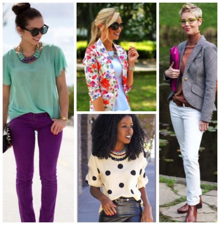
Spring palette hallmarks: Lively bright, medium contrast in styles that are no fuss, cheerful, natural. Because of the relative brightness and clarity of their coloring, Springs can play with colors that are opposite or nearly opposite on the color wheel (complementary, split complementary and triadic colors) in cheery blocks of color and crisp prints.
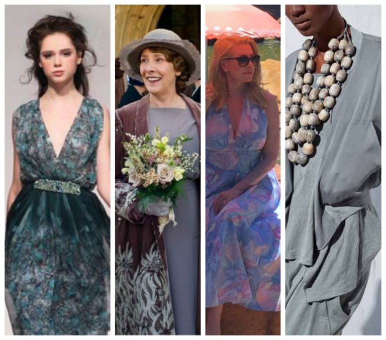
Summer palette hallmarks: Muted with gray, soft, low contrast. The grayed tones make most Summer palettes relatively cool, which means that the colors they look best in are closer together on the cool side of the color wheel, either analogous or monochromatic. This creates a quiet blended look. Think Monet’s water lilies, or velvet drapery.
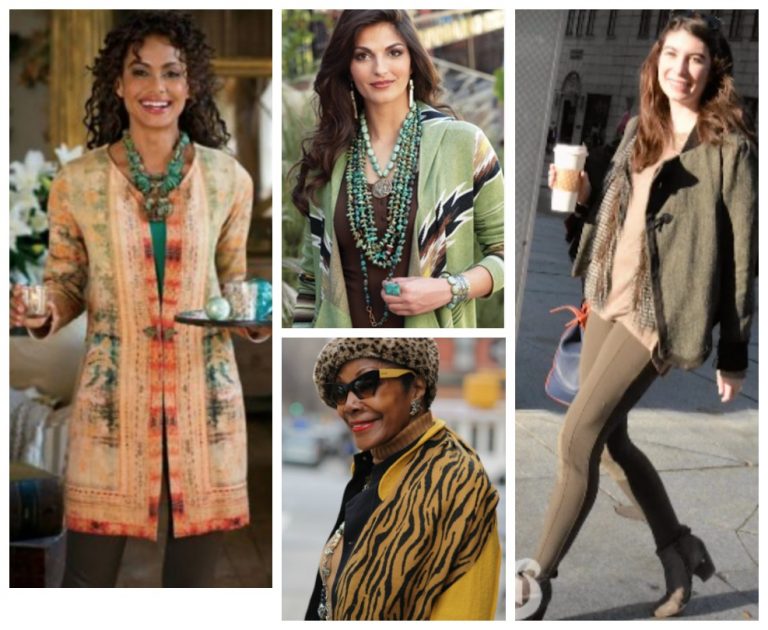
Autumn palette hallmarks: Earthy, toasted with brown, rich, medium contrast. Like Summers, they also look best in colors that are analogous or monochromatic—but on the warm side of the color wheel. The earthiness of the colors translate well into animal and nature prints, exotic or tribal patterns, and the use of leather, fur, bone, and other such natural elements.
Photos speak louder than words, so learn more on my Pinterest boards for each season, here. Or email me here..
Pinterest Boards for each Season, and much much more.

